Papers : Cherish 2006 Calendar
Stamps : Essential Alpha, Giggle Caps
Accents : Autumn Terracota brads, White brads, white buttons
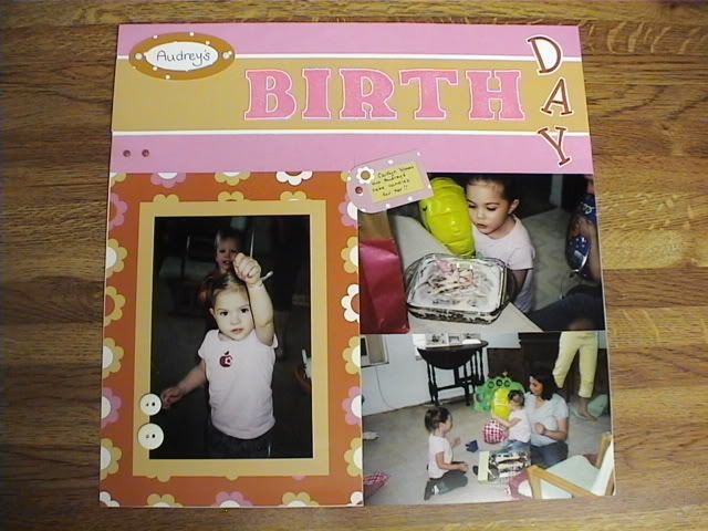
 Working on this layout was weird in more ways than one. First I cut it up into three pieces then ended up completely cutting out the top strip. I kept playing around with the pieces, not quite happy with anything until I hit this. The initial layout was simpler but I kept adding as I went and I'm really happy with it now. For the other weird, I was using orchard bouquet to stamp the title but it was like.... really purple compared to the rest of the paper and the cardstock. I went through a couple pinks and found that bubblegum matched really well but it was a bit of a shock that the orchard bouquet seemed so far off. I have noticed with the cherish calendar that because the paper is glossy, some of the colors are a bit different, usually brighter. It all worked out in the end though. Now I can use the B&T papers from the Days to Cherish for the rest of the pics :D
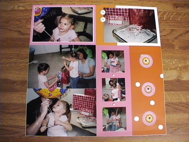
No comments:
Post a Comment