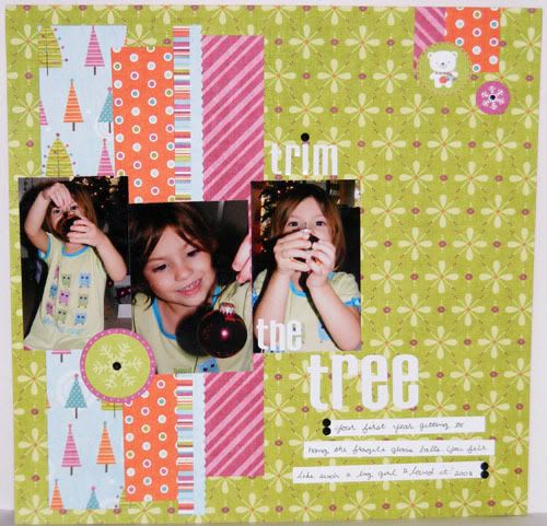
 Supplies : Paper and Elements Colorful Christmas by My Minds Eye; Remarks Letter Stickers by American Crafts; Black Rhinestones by Kaiser
And here's the layout I made with which the scraps I used in the last two cards were made from. I had actually cut the papers out weeks ago for the Inspired Blueprints #38 sketch and never got around to actually putting together the layout. And I had even made the cards before I finally glued everything down on this page, lol. These are of Audrey the Christmas before last. It was her first year getting to hang the fragile glass ornaments and she was so excited, I could tell she felt like such a big girl. The pictures weren't that great but the sketch's smaller photos made them look a lot better since it focused in on her. I love it when I can make funky photos look better on a layout ;) I've enjoyed the comments on whether or not you'd redo any of your pages. I think for me I'm going to consider redoing some of them, especially since a lot of them didn't have the journaling that they should since back then I didn't journal on the pages. I don't mind if I get further behind since I know with scrapping you're never really caught up, lol. And I think it would be fun to go back and do something different with the baby pictures. I don't want to take apart any pages though, so I think I might put them in books for the grandparents since neither Paul or my mom scrapbook but they love the albums ;) To answer Kim's question, the daughter title on my baby girl layout is a sticker from Pebbles Inc baby line. Thanks for popping by and have a splendiferous Monday!
4 comments:
Adorable layout! Love the mixing of patterned papers!
Blessings,
Kim xXx
Such a darling layout!
Adorable layout, I can still remember when I was allowed to hang up the 'special' ornaments. Too bad I broke 3 of my own this year! Great progression of photos, a great use of the sketch.
Love this layout of your daughter! Fun and funky!
Shanna :)
Post a Comment