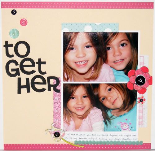
 Supplies: Paper - Cosmo Cricket, Making Memories, Basic Grey, Scenic Route, and Creative Imaginations; Chipboard Flowers (Urban Prairie) by Basic Grey; Cardstock by CTMH; Buttons by Papertrey Ink; Thickers by American Crafts; Ribbon from LSS;
I pretty much lifted this layout right out of the May/June 09 issue of Scrapbooks Etc. The inspiration layout is on page 122. It was a lot of fun to make even though it took me a while to get going. I had such a difficult time picking out which papers to use and I ended up using all scraps which made me feel good about whittling down my ever growing scrap paper pile. My page is definitely busier than the inspiration one, I added more flowers, the ribbon, and my title is bigger. After finishing it I realized my title could be read two ways though - together and to get her! I guess since they are both girls it still fits no matter which way you read it :D Enjoy and have a happy Monday!
4 comments:
CUTE! Lovely colors! The girls look so much alike - so sweet.
What a great layout of your girls. Great job using scraps.
I love that everything matches what they're wearing. So adorable!
So beautiful! This is an awesome layout.
You are right about the letters....it does read both ways. I read it as together the first time I looked at it!
Post a Comment