 Supplies : Paper and Elements by My Minds Eye; Cardstock and brads by CTMH; Remarks and Thickers by American Crafts; Flowers by Prima
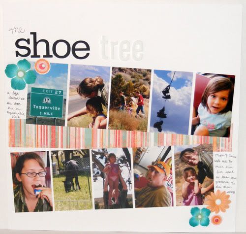
This first page is almost a direct lift from the layout in the magazine only I put it all on one page instead of two. What drew me to the inspiration layout was the almost slideshow like presentation of the photos. It went perfectly with the photos I have since they seem like a modge podge of pictures that don't really make sense or tell a story. Most of the photos weren't great either so this gave me a chance to think about what to keep in each photo since the cropped size is 2 x 3.25, about a quarter of the picture. It allowed me to show the better part of all the pictures I wanted without making the layout look terribly busy. The pictures themselves seem busy enough. I did notice that there weren't any pictures of me, something I need to work on. Despite the fact that I don't like to have my picture taken, I need to get Paul or whoever is around at the time to take some pics of me with our family so that I can be in our scrapbooks too.
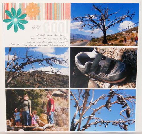
 On this second page I did another quick and easy photo pocket sheet protector style page, this time with horizontal photos. It was important to me that I not crop these particular photos very much and this double page layout was actually the first one I made to set the feeling for the other pages. We don't actually know the story behind the shoe tree, but we do know that it goes through phases. I'm not sure who it is that cleans up the shoes, but there are seasons when the tree is full or close to empty. Paul's brother was the one who told us about it and suggested we take a little excursion out there to shoot some photos since at that time it was full of shoes and also just to see this fun landmark about an hour away from where we live. Directly across the street from the tree are some horses which Cait found way more interesting than the tree, lol. It was a fun little detour from the everyday. Friday I'll have the final page posted. Until then have a great week!
3 comments:
What fun layouts and a neat tree. It's great that you've documented your outing to visit this landmark.
This tree is sooo cool! It reminds me of a tree in the UK where everyone sticks pennies in the trunk...now there are hundreds of thousands of pennies in it. I will have to post the picture.
I just love your LO...Such a cool subject.
What a neat thing! And I love the layout.
Post a Comment