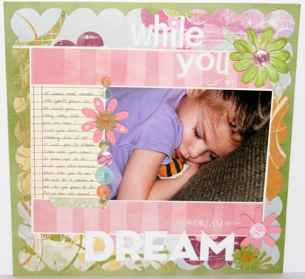
Supplies: Perhaps paper by Basic Grey; Discovery Paper, Buttons, CS, and ribbon by CTMH; Rub-ons by Bo Bunny; Flowers by Prima; CS flower unknown (RAK); More buttons by My Minds Eye; Thickers letter stickers by American Crafts; Journaling pattern paper by CollegePress
This layout was done for the #1 Inspired Blueprints sketch. They just barely went live on the 1st and are looking like they will be a great sketch site to visit. A sketch is posted on the 1st and the 15th of each month and they are very 4x6 photo friendly so far. This photo is a 5x7 for the sketch but I saw one of the designers use a regular 4x6 pic in her example. In fact this sketch was perfect for this photo. I had taken only one (SO rare for me, lol) so I had a 5x7 printed out already instead of a 4x6 since I knew it would be the only pic on the page when I got around to scrapping it. I adore how this came out. The journaling is very meaningful - about what I wonder what Audrey will grow up to be, what she will be like and if she'll still be like how she is now, shy and loves animals. I tried to be a little poetic and I started off the journaling with the title and then ended with the title. It was a very fun layout for me to make, very out of my box but I think I did fairly well in still keeping this layout to my own style.
(EDIT:)So Blogger is still having trouble with the photo thing, but I've figured out how to get my photos back to posting the correct size. For those also using blogger that haven't figured it out yet here's what you do. You need to go into the edit HTML tab and find this section in the code for your each of your pictures in your posts: (This will be within an alligator bracket)
img style="DISPLAY: block; MARGIN: 0px auto 10px; WIDTH: 600px; CURSOR: hand; HEIGHT: 481px; TEXT-ALIGN: center"
The problem lies in the sections I've marked red. Your numbers maybe different, but these are what determine whether your picture fits within the post or not. Just simply change the width to 400 and erase the height part so it looks like this:
img style="DISPLAY: block; MARGIN: 0px auto 10px; WIDTH: 400px; CURSOR: hand; TEXT-ALIGN: center"
That will allow your photo to fit within your post and should keep the aspect ratio of your photo (it did with mine). You will have to check all your future posts as well since I notice it's doing it to the ones I scheduled recently but haven't been posted yet. When you preview your post and are in the compose mode your photos may look smaller than usual but the photos should publish to fill the body of the blog text. Kind of a pain in the butt, but at least it works for now :D Good luck everyone, and I hope that helps!
4 comments:
So sweet - love the title! Oh, and did you figure out the photobucket pics thing? Mine are still posting HUGE and I'm trying to get some stuff scheduled to post - any advice?
Your layouts are amazing!
Such a precious layout. I love how you put your dreams of her in the journal.
I love your layout! Blogger has been crazy lately! But I'm glad for the tips. Sometimes html drives me crazy too, lol.
Post a Comment