9.30.2008

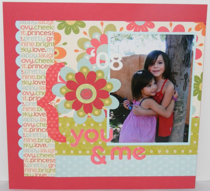
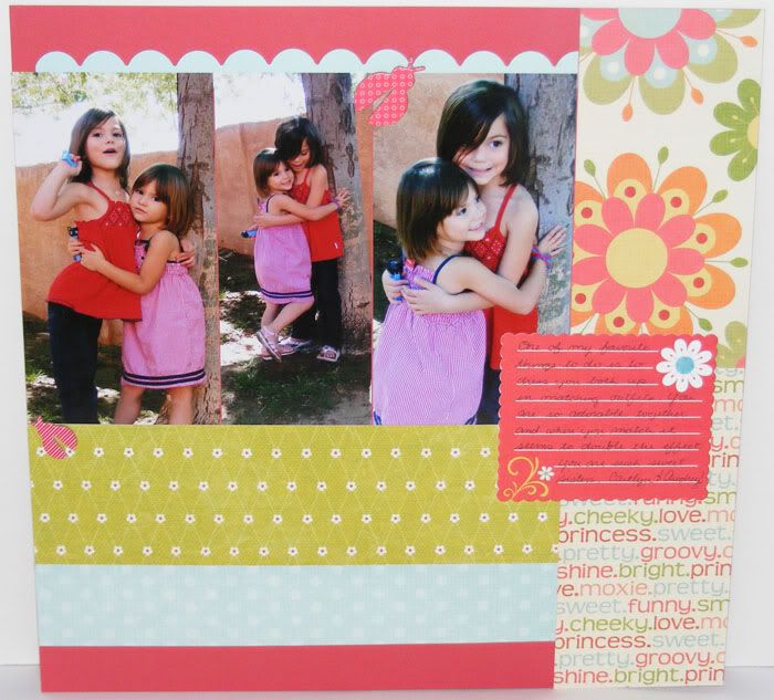
You and Me


Supplies: Pattern Paper, Flower and Bracket Element, Journaling Prompt by My Minds Eye; Cardstock and Metal Circle Element by CTMH; Puffy and Foam letter Thickers, Chipboard Ladybugs by American Crafts

This layout is totally lifted from this Pebbles Kit Layout. Pebbles has some great easy/quick layout kits and while I rarely have a use for the particular kits (they just never seem to fit the pictures I have) I do love their very simple approach to scrapbooking. So I lifted the layout to fit with some pics I do have and my own paper and I have to say I think it turned out super cute! Using Tulip again for the background cardstock. It matched these papers so perfectly!! Thanks for stopping by and have a great Tuesday!

9.29.2008

Color Challenge #32

Fall is in the air.... somewhere, lol. Not here where I am. The weather still gets up to the 90s and though it has been cooler this past week, I can tell we are still a bit aways from fall. But, it's the end of September. School days, cool nights, and the thought of falling leaves brings autumn into my mind. The colors are inspired by fall and this week we will be exploring Tulip. To play use at least 3 of the colors and then send me link to your artwork so I can add it here. Have fun!!

Tulip
Honey
New England Ivy
Vineyard Berry

Alanna's Turning 31 Layout

My Sample:
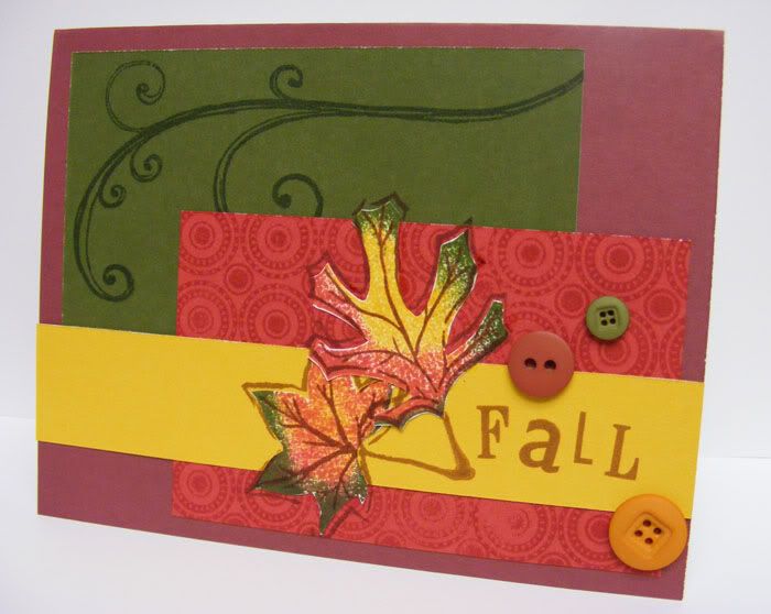
Supplies : Cardstock, Buttons, Season of Change, Hodge Podge Alpha, Spot on Backgrounds, and Playful Flourishes stamp sets all by CTMH


Since I was inspired by fall I wanted to make a simple fall card. I am loving Tulip! It works both as a red and as a deep pink. This was a quick easy card. One flourish stamped in New England Ivy on NEI cardstock, Spot on backgrounds stamped in Tulip on Tulip. The leaf bases were stamped first in Honey then rolled in NEI and Tulip inks, then cut out. I simply glued the card together then stamped the leaf outlines in vineyard berry right on the card. Fall was stamped in vineyard berry as well. Embellish with a few buttons and that's it! ^_~ Have fun with the challenge and thanks for playing!

Title Troubleshooter

Leanne was talking about not being able to come up with titles and since I don't have my camera to post the color challenge with, I decided to write a little short on what I do and maybe it will help someone out :D Once I pick out the pictures I want to scrap with I start trying to think about the story behind the picture. What is happening? How do these pictures make me feel? When were these pictures taken? Where is this place? Why did I take this picture? Usually I just run the answers through my head, something pops out at me, and that's what I end up using for a title. Other times I have to brainstorm harder to get an idea for a title in my head. Here are some of methods I turn to when inspiration decides to leave me high and dry.

Start with just a single word. A past layout with Cait reading a book I used the title "quiet"; another focusing on her and her cousin was titled "Pals". On one of the layouts for my future posts the title for the page is simply "dance". Coming up with just one word to sum up the layout is sometimes easier than trying to come up with an entire phrase. I like to use verbs, adjectives, or feelings for my word. Seasons and locations work great for this too! Think of what is happening in the photo(s). How would you describe them with just one word? Or what feeling does this picture give you? And there is your title!

Expanding on that, sometimes I want to have a phrase as a title to help convey the story about the pictures instead of just a single word. Since it is simpler to come up with individual words or short phrases for a spread of photos, I basically do that then build upon it. The Personality page I did just a few posts back was one such title. I knew I wanted to talk about Caitlyn's crazy hair and about her personality. Personality became the main word and I used the title to spotlight that word, adding the rest of the phrase in smaller, supporting text. I used the story about her crazy hair photo op to portray a couple of the reasons why she 'has so much Personality'.

The idea with expanding that single word into a title can go along way to helping display your story. Often I use what I'm planning to journal about as a catalyst for unvieling possible layout titles, and many times I can pull a few descriptive words that sum up the story and use that as a title instead of trying to find words that describe the pictures. Throughout the years I've learned that I enjoy the layouts with fun stories much more than the layouts with aesthetic appeal but no journaling. Sometimes a title can say it all, but more often than not it's the journaling that takes someone through the adventures of your scrapbook. I almost always journal last but that doesn't mean I don't have an idea about what I'm going to journal about. While putting your pages together think of what you want to say on the layout. What story do you want to tell with these pictures? Then use the subject matter in your journaling as a jump start point for creating a meaningful title.

Sometimes all you need is to describe it, literally. "Christmas Morning PJs", "Pretty Easter Flowers", "Caitie's Pony Parade"; they aren't jazzy or super catchy but they convey what's going on and start the reader off knowing exactly what's on the layout. I like using these titles for things that happen consistantly. Like our Christmas Eve tradition of opening a single present. The title for the page every year is usually the same, "Christmas Eve Tradition". It connects each year to the next with a common theme. Think of what is happening and just describe it with a few words and viola! This also leaves your journaling open or the ability to put many bits of journaling, hidden or viewed, to talk about an event.

Use phrase titles. These titles, for me, go along the same lines as descriptive titles only a little snappier. Trying to come up with a fun phrase you like is sometimes trickier though, and here are some of the things I do to help me find them. Think of how else you can say title yet keep the integrity of your original idea. Is there a catchy cliche that goes with the pictures or story? A play on words you can use? Lyrics from a song or a line from a movies that matches? These titles double as a kind of journaling prompt as well, especially if it's not a something most people would 'get'. You can use that opportunity to journal about the title and how it fits with what is going on in the pictures, which is quite handy if you are struggling with trying to find a story to write about in your journaling.

Just use what was said by inserting real life quotes as titles. I used "I'm doing Cooking" for one of my recent layout titles. It's one of Caitlyn's cute improper grammar responses and I wanted to capture that along with the fact that she loves to cook. These titles already start to tell the story before you even read the journaling and add a little personal flair to the page. Use a common response as a title or an out of the blue phrase that is memorable . Think about what was said in the pictures or what you imagine them saying from the looks on their faces. Was there a funny one liner? A response that is always the same? A comment that was just totally off the wall? Use it as your title, then journal about the phrase.

Regular quotes and poems are occassionally the way to go as well. Sometimes there is a quote you have always loved, or a poem that is dear to your heart. Use a part or all of the quote as a large title. Emphasize a section of the poem or the title of the poem as the title for the layout. Short quotes work great as titles that run down the side of a page. Or even as subtitles! But that is a whole other can of worms, lol. I hope some of these ideas helped. Remember that there aren't any rules to scrapping. If you love it, Scrap It!! The color challenge will be up once I get my camera back to take a pic of the sample. Until then, if you want an early start the colors are Tulip, Honey, New England Ivy, and Vineyard Berry.
9.27.2008

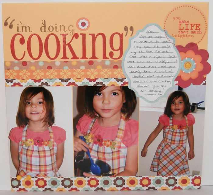
"I'm doing Cooking"


Supplies: Pattern Paper, Borders, Trasparency, Flower Elements, Journaling Prompt by My Minds Eye; CS by Bazzil; Chocolate Alpha and Friendship Large Alpha Stamps and ink by CTMH

"I'm doing Cooking" Caitie says after I ask what she's doing, lol. Cait loves to pretend to cook and to try and help me really cook as well. She even likes watching the Food Network on the very rare occassion that I actually turn on the cable. This was the first time she got to wear this dress and she just looked like such the stylish little homemaker! I wish I looked as cute while whipping up dinner ^_~

A fun simple layout using up stripes of leftover pattern paper and a border. With all matching stuff from one of My Minds Eye's lines, it was super easy to just throw this layout together. I used some of the new alpha stamps from CTMH as well, replacing the dot of the I with another My Minds Eye flower element. The inspiration came from a layout in Scrapbooks Etc., though my finished layout doesn't seem to resemble same design as the layout I took the inspiration from which was an 8.5x11 Halloween layout. However, if you look very closely it's there.

9.25.2008

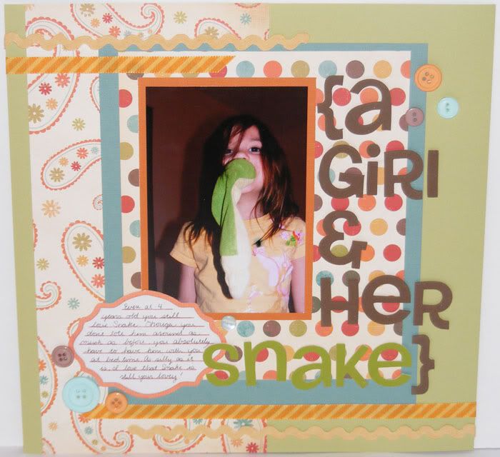
A Girl and her Snake


Supplies: Pattern Paper, Buttons, Ribbon, Journaling Prompt all by My Minds Eye; CS by Bazzil; Thickers foam letters by American Crafts
I can't help but love pictures of my girls with their lovies. I know that one day Cait will outgrow Snake and I think I'm the one that's going to be heartbroken over it instead of her. It's hard to imagine her getting tucked in without loyal little Snake clutched in her hand, or find him in various parts of the house wherever Cait had left him last. For now he still remains quite the lovie. Though she doesn't quite tote him around as much as she used to, Caitlyn still absolutely needs him for bed time and comforting.

I used a large and longer title with this page to help fill it since there is only one 4x6 picture. The pattern papers were scraps and since the dots paper blended into the paisley paper too much I used some blue bazzil to back it and help it pop. The fun ribbon was an afterthought, but really completed the page and the last thing I finished was the journaling (which is usually what happens anyway). I'm finding I love these pretty journaling mats. They don't leave a ton of room for a big story, but if you just have something short and sweet to say they are perfect. And they even make my sloppy handwriting look elegant!

9.24.2008

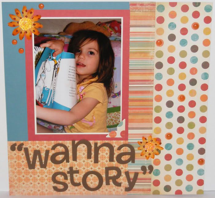
Wanna Story


Supplies : Pattern Paper by My Minds Eye; Flowers by Petaloo; Cardstock and Brads by CTMH; Foam Letter Thickers by American Crafts

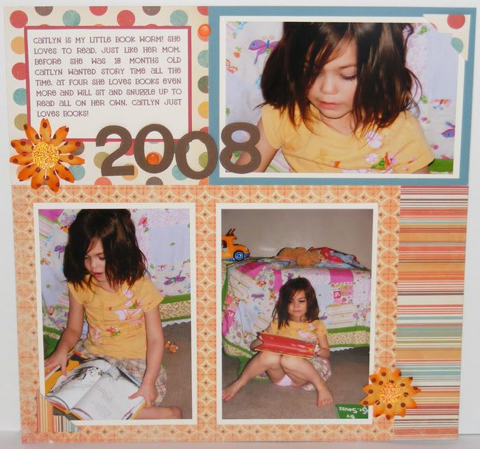
Another layout done at Julie's and inspired by Simple Scrapbooks. The left page was another lift from one of the magazines with the right my created companion. Caitlyn has always been such a little book worm. I can read story after story and still she'll say she wants another one! I adore that she loves reading as much as I do and hope that at least this will be something that is easy for her. She's had a love of books since around her first birthday and it's blossomed and grown to where she loves to read parts of the books she knows best outloud with me.

The basic design is very linear and simply blocked which made this layout super easy and super fast to put together. I added just a few dotted flowers with cute microbead middles for some pop and with the fun papers and cute quote title it didn't feel like I needed to add much more. Some big brads were placed here and there on some of the orange dots to give a little more dimension to the layout and in the upper left corner of the lefthand layout to help anchor the flower a little more. I love how well these papers complemented the colors of Caitlyn's shirts and the books in the pictures.

9.23.2008

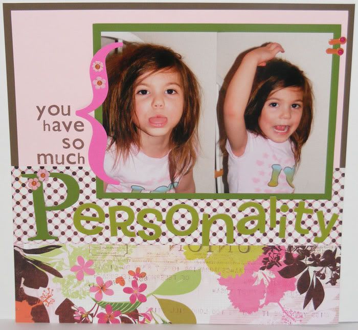
You have so much Personality


Supplies : Sultry Paper by Basic Grey; Cardstock, brads, photo clips, Hodge Podge Alpha Stamps, and Chipboard by CTMH; vinyl letter Thickers by American Crafts; Flowers unknown (RAK item)

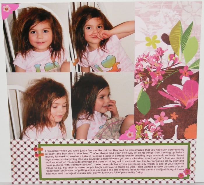
Thanks for the welcome back ladies! It's so nice to post again. Caitlyn cracks me up. She is always being so silly and has so much personality that it's a daily roller-coaster ride just being around her. This layout was made at Julie's. She has a great stash of Simple Scrapbooks magazines and since I don't buy any magazines myself, it's great inspiration to look through the ones she has and see what is new out there. The left side of the layout was inspired by one of the layouts in the magazines (can't remember which, lol). I remember her asking what do you do with really pretty paper like this (the one I used in the layout). I didn't quite know myself since usually I just keep it in my stash since it's so pretty I don't want to cut it, lol. But I think this approach worked gorgeously.

The pictures were just supposed to be of Caitlyn's silly hair but as I started to put the layout together I realized that they showcased a lot of Caitie's funny personality, crazy hair and all. The journaling and title evolved to be more about Caitlyn's personality and how I had snapped the photos to show off Caitlyn's hair but instead of a simple photo shoot, Cait gave me a myriad of funny faces to show off instead. I remember the inspiration layout was only an 8.5x11 and used just one photo. I put the two photos together and used the basic design enlarged to 12x12. I really liked the look of the photos flush like that and carried it onto the right page. I loved the very simple lines and unobstructed view of that beautiful paper. The added plus... it really complements my blocks of photos ^_~

9.22.2008

Color Challenge #31

Did anyone miss the color challenges while I have been MIA? Well surprise! I have one for you this week if you want to play ^_~ And it uses one of the new colors as well. Remember to play all you need to do is make a new project using at least 3 of the colors from the challenge. Send me link to your artwork and I will post it too this thread as well! Have fun :D

Juniper
Olive
Honey
Cocoa

Ashley's Awesome Sk8Rbella
Sparkle's Adorable Riley Card
Jena's Darling Cupcake Mouse Card
Kim's Amazing Star Birthday Card

My Sample:


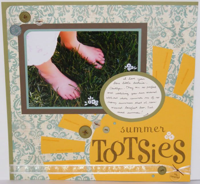
Supplies: Perfect Day Paper, Olive Buttons, Chocolate Waxy Flax, Chocolate Large Alpha, Chocolate Alpha, Friendship Large Alpha, Classmate Alpha, Juniper Brads, Col White Ribbon, Flower Metal Accent, and Cardstock by CTMH; Rub-ons by Bo Bunny; Clear Buttons by Doodlebug; Be Barefoot accent Unknown

I grew up always playing outside barefoot. My mom didn't ever have a problem with this, after all she grew up in the Philippines and went barefoot everywhere out of necessity. And it's funny that I would be so concerned with my girls having shoes on when they play outside. After all, I'm still going around barefoot, why shouldn't they? Well, I think the answer to that is that I'm way more protective of their perfect little piggies. But my girls follow the barefoot heritage of both me and my mom and run around barefoot outside as well. It reminds me of the many summers my brother and I spent outside barefoot and when I remember those times, it doesn't seem like such a terrible thing that they are running through the grass without their shoes on.

I really want to say thank you so much to all of you that posted comments or emailed me with support and encouragement about Caitlyn, or even just to say hi over the past couple months. It makes all the difference to read your encouraging thoughts and quick check ups. So thanks! We've been doing pretty good the past month. It's still a bit hectic, but I think I've got it down to where I can make some time to create at least a couple times a week. Now it's whether or not I can get the creative flow to work when I get that time, lol. Hopefully though, I'll be able to start doing the color challenges consistantly again ^_~. I've got some fun artwork scheduled to post throughout this next week of the very few layouts I've done over the past couple months, lol. So stayed tuned :D Hugs to all my readers out there! Thanks for sticking around!