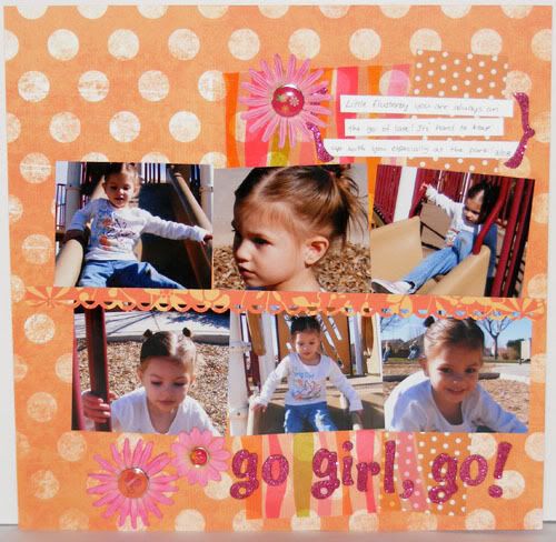
 Supplies : Paper - My Minds Eye, Pebbles Inc, and Scenic Route; Transparency by Making Memories; Glitter Thickers by American Crafts; Flowers by Prima; Big Glazed Brads by Imaginescence; Glazed Brad by Basic Grey; Apronlace edge punch by Fiskars; Sketch by Inspired Blueprints
I played with the #30 Inspired Blueprints sketch with this layout and also the layout I posted yesterday (inspiration for that version came from Designer April Yap's interpretation of the sketch). This one was closer to the original sketch design. I took colors for the layout from the colors on Audrey's shirt. Focusing on the orange and metallic pink I built the layout around those colors and included a transparency (the Practical Scrappers Challenge this week) on my layout, cutting the design by it's curves and using it in place of the patterned paper. Like with pattern paper, try cutting along the design in a transparency to add interest to your layouts. Enjoy the layout and have a terrific Tuesday!
No comments:
Post a Comment