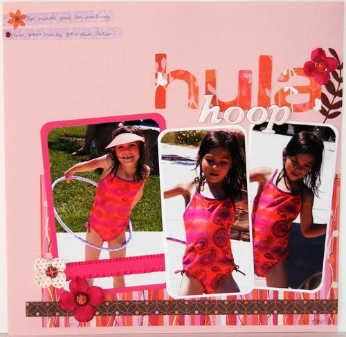
C tried so hard this summer to learn how to hula hoop and she nearly got it down! I noticed that the smaller, lighter hoops were easier for her to use. She is so cute to watch! This page was the second layout I did at the crop. The Slice and Thickers title was the inspirational starting point for the page. I knew I wanted to cut the word hula out with that Basic Grey paper and then layer the Thickers over it but that was about it, lol. Luckily the rest of it just came together after that ;) I hope you enjoy! Thanks for visiting and have a great weekend!
3 comments:
She's so cute!! What's the chances she'd have a suit that matched that paper so exactly!!! Love how simple and clean the layout looks!
Love how this turned out Marjorie! Such fun and cute photos to start with and then perfect papers and embellies! So fun!
What a fun layout. The papers are perfect for the pics.
Post a Comment