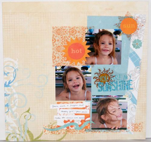
This week the challenge at Practical Scrappers is how to use transparencies. I think transparencies are so fun but like vellum and other clear paper choices it's often hard for me to think of ways to use them. A transparency gives you the opportunity of having floating patterns, images, and even text on your layouts and cards. Here I used a transparency to substitute pattern paper. It let the base paper show through for a fun addition of pattern without having to add so many colors. This is also great for die cutting like I did here with the sun. Try using white printed transparency patterns for snow or cloud shapes. Layer a pattern transparency over chipboard letters for added contrast.
Don't forget transparency titles or decorative elements like my title here. I like using mine on solid or nonbusy monochromatic prints so that they stand out. They are also great for layering over pictures and many manufacturers have 4x6 transparency lays specificallly made for that purpose. Try using a transparency to accent your title or journaling. Or if you have a printer you can print your journaling right on a blank transparency so that your story floats on the page. I hope some of these ideas spark inspiration on how to use your transparencies. Don't forget to visit the Practical Scrappers Blog for more ideas on how to use transparencies. Have a wonderful Monday!
Don't forget transparency titles or decorative elements like my title here. I like using mine on solid or nonbusy monochromatic prints so that they stand out. They are also great for layering over pictures and many manufacturers have 4x6 transparency lays specificallly made for that purpose. Try using a transparency to accent your title or journaling. Or if you have a printer you can print your journaling right on a blank transparency so that your story floats on the page. I hope some of these ideas spark inspiration on how to use your transparencies. Don't forget to visit the Practical Scrappers Blog for more ideas on how to use transparencies. Have a wonderful Monday!
Great layout. I love the transparency under the circle used for the sun. And I love how you used it for your title. I had a difficult time with this challenge as I have NEVER used transparency.
ReplyDeleteSuch a darling layout!
ReplyDelete