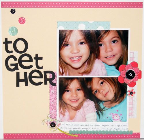
 Supplies: Paper - Cosmo Cricket, Making Memories, Basic Grey, Scenic Route, and Creative Imaginations; Chipboard Flowers (Urban Prairie) by Basic Grey; Cardstock by CTMH; Buttons by Papertrey Ink; Thickers by American Crafts; Ribbon from LSS;
I pretty much lifted this layout right out of the May/June 09 issue of Scrapbooks Etc. The inspiration layout is on page 122. It was a lot of fun to make even though it took me a while to get going. I had such a difficult time picking out which papers to use and I ended up using all scraps which made me feel good about whittling down my ever growing scrap paper pile. My page is definitely busier than the inspiration one, I added more flowers, the ribbon, and my title is bigger. After finishing it I realized my title could be read two ways though - together and to get her! I guess since they are both girls it still fits no matter which way you read it :D Enjoy and have a happy Monday!
CUTE! Lovely colors! The girls look so much alike - so sweet.
ReplyDeleteWhat a great layout of your girls. Great job using scraps.
ReplyDeleteI love that everything matches what they're wearing. So adorable!
ReplyDeleteSo beautiful! This is an awesome layout.
ReplyDeleteYou are right about the letters....it does read both ways. I read it as together the first time I looked at it!