Buttercup
Lilac Mist
Garden Green
Bamboo
To play create a new project (card, layout, altered item, etc.) using at least 3 of the 4 colors. You can send me a link to your creation and I'll post a link to your sample on this thread. Have fun!
Sue's Layout and Card
Laurel's first two cards and her third card
Sparkle's Card
Emilee Ann's Card
Jane's Triple Challenge Card
Marcia's Card
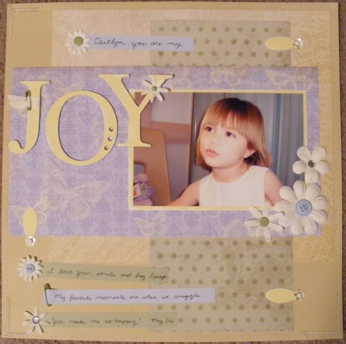
My example :

Colors : Bamboo, Garden Green, Lilac Mist, Buttercup, Colonial White
Papers : Life Delights, Sonata, Floral Tapestry
Accents : Dimensional Elements Alpha and Ribbon Slides, Rhinestones, Buttons, Col White Grosgrain, Garden Green Accessories, Flower sequins, Just Blooms White Daisy, Bigger Blooms, Col White Brads, Sewing
I have a hard time scrapping just one photo. It didn't used to be that way. When I first started scrapping 12x12 pages I did one photo and 2 photo layouts all the time. I have five 70 page 12x12 albums of Caitlyn's FIRST year because of scrapping that way lol. Some of them had a few more pictures than that, but the majority was one photo on one page and two photos on the matching page. I'm also one of those people who has to scrap every photo. After seeing that this method was just not reasonable for as many pictures as I take I tried to include more photos on a layout. Now I usually have an average of about 7 pictures between a two page layout though the only thing I think has really changed is that I just take more pictures of the same event lol. So really I'm probably scrapping the same amount of pages, I'm just taking more pictures to fill them up with! Anyway, I decided to try sewing on this layout. The thread isn't nearly as visible as I would have liked but that's probably a good thing seeing as my sewing is anything but straight, lol. I have terrible sewing skills! I'm going to go with the idea that my crooked sewing makes the page look more whimsical ^_~
Lovely, I'll see what I can do today (home today with sick child). I made a couple of cards using Thoughts of You earlier but I will challenge myself to make something new for you.
ReplyDeleteWOW MARJORIE YOUR NEW LAYOUT IS JUST GORGEOUS! THE SWEETIE IN THE PHOTO IS TOTALLY ADORABLE.
ReplyDeleteMarjorie I made a few. You can see them on the CTMH BB and on my blog.
ReplyDeletewww.want2scrap.blogspot.com
Love your layout, you always make the colour challenge look easy! Thses colours look fabulous together, hopefully I will get a moment to play this week, it hasn't been a good start for me so far!
ReplyDeleteMarjorie,
ReplyDeleteHere's my take...
http://www.emileeann.com/?p=1070