Colors : well, they would be Holiday Red, Citrus Green, Clover Meadow, White Daisy
Papers : Pebbles Inc Holiday set - small stripe and dot, white card bases
Stamps : No Peeking, Joy, Christmas Scripts, Confetti and Favors
Inks : Holiday Red, Clover Meadow
Accents : Ribbon (Pebbles), White brads
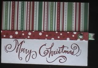
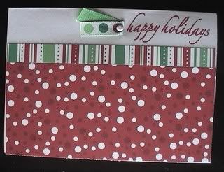
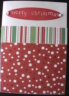
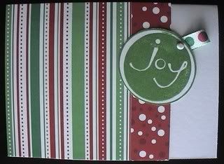
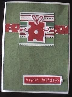
Now, I say contraband because normally the only products I use are CTMH (first because I like them better and second because I'm a consultant). But this time I just wanted a couple sheets to play with for examples. That and it's nice every once in a while to see what the other companies have out there. And even seeing all the other stuff, I still like our stuff better :D. Anyway, those are the cards I came up with and the nice thing is it helped me devise a template to make 20 cards from just two sheets of patterned paper plus card bases. Some of these cards are part of that template and some of the others just helped me get there by using their samples. You make four cards each of five designs and I'm pretty proud of it since it's very economic ^_^. I'll be making regular CTMH ones later after I finish tweaking the template.
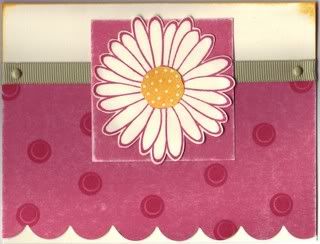
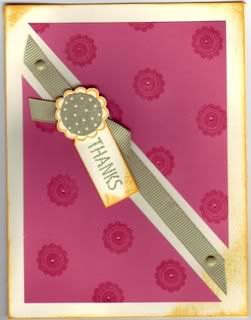
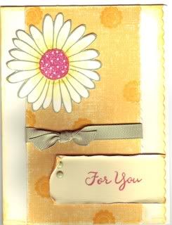
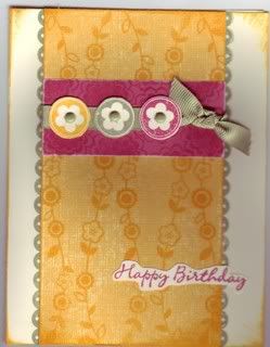
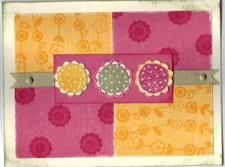
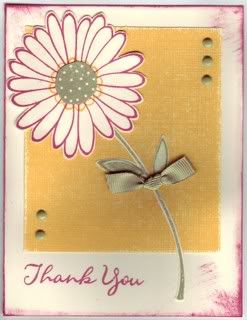
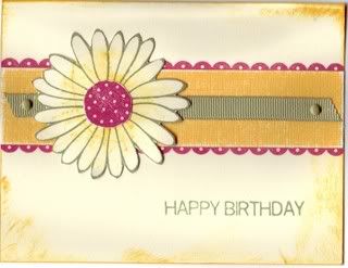
These other cards are the ones I'm designing for our Fabulous Friday enrichment activity in our church. I'm in charge of the free make and take cards. Now I wanted to make them really nice and fun, but inexpensive as well since I'm on a budget. These are what I came up with. I might end up getting different pattern paper for each card for the actual event, this was just used to help me come up with some designs.
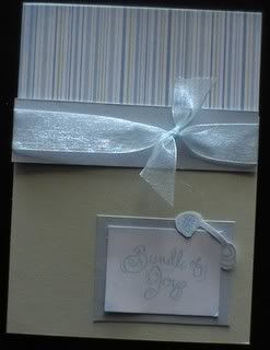
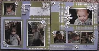
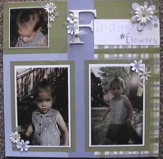
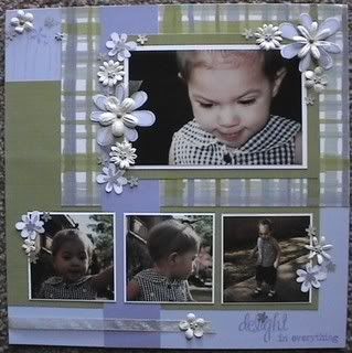
Colors : would be about - Heavenly Blue, Key Lime, Crystal Blue, White Daisy
Paper : Baby Boy Stripe by Pebbles Inc., Baby Blue CS, Honeydew CS both from pebbles
Stamps : Delight in Everything, Christmas Scripts, Music of Winter, Little Angel
Inks : Crystal Blue
Accents : Heavenly Blue Organdy, Silver brads, White embossing powder and acetate, chalks
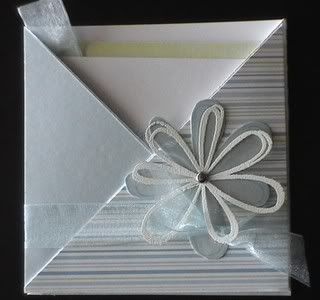
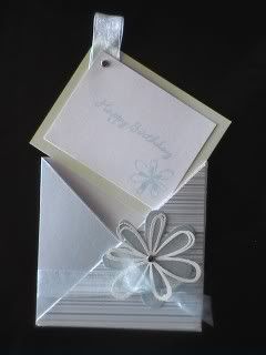
This really fun flower card is called a crisscross card and it's the first one I've even made. I think it turned out very well for my first one. The colors in the picture are a bit subdued probably because of the lighting. In real like it's brighter and very cheery. The colors are actually classic baby boy colors, even the stripe is from the baby boy section, but I think blues and greens are great for any occasion!!
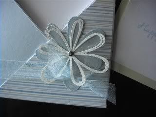
A closer look at the flower which is white embossed on acetate. I love this look and haven't done it until now just because I was lazy and didn't want to get out my embossing stuff :P. But the results are well worth the few minutes it takes to make the flower. It's what really makes the card 'pop!'
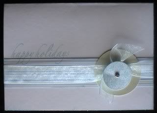
This card was the first thing that came to mind when I saw this paper. It was a little simpler in my head but by the time I finished it, I really loved it. I'm so sad that my camera just doesn't do these cards justice. It's light and wintery, the edges of the card distressed in the same blue as the happy holidays and snow flake.
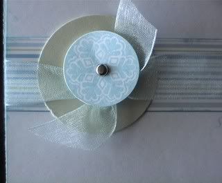
Here's a close up of the snow flake. I put the brad in then used a pop dot to raise it and mounted it over the ribbon on a 2" circle punch out of the green. I love the effect!
And this is obviously a baby boy card. Simple and elegant. The added plus was that this was the simpliest card to make. You can't see it but the edges are distressed with chalk that gives it this soft feeling. All in all, I'm really happy with the way these turned out.
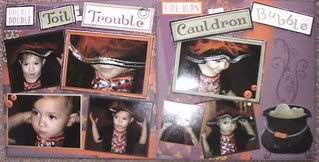
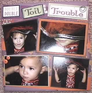
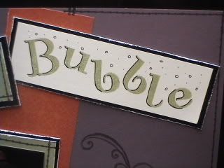
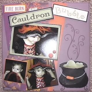 The cauldron I drew and cut out on black cardstock then sanded and colored to make the shadow with the black marker. It probably took longer to do that cauldron than both the pages put together, lol. The handle is grey wool cardstock distressed with gray wool ink. I used my oval coluzzle for a guide. A circle punch was used for where the handle connects to the cauldron and sanded autumn terracota cardstock was for the wooden piece on the handle. The legs and steam are from the flourish stamp. The page design is my own. I also did some fun doodling on the words trouble and bubble.
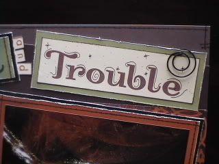
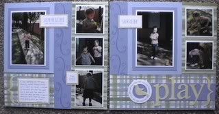
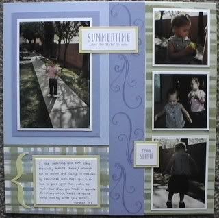
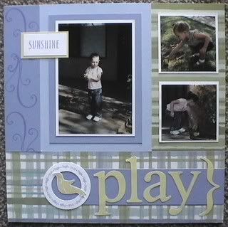 I used chipboard tracings for the letters for play and the brackets. I was going to put the yellow on the chipboard but decided to just glue it on as just cardstock and save the chipboard for another page :D. I like the way it turned out and I didn't even use any embellishments! It still took me nearly two hours though, mostly because of cutting out stuff and I stamped five other birds and cut them out before realizing the page didn't need them and looked too busy with them on it.
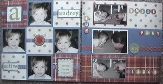
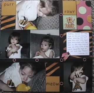
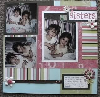
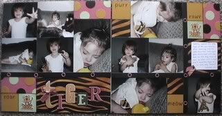 I almost never use black so this was a challenge for me as I love lighter color pages. And in the end I loved this layout. It's so bright and fun! The journalling talks about her Tiger and how she takes him everywhere with her, even to bed. These two took me all day since I had two little helpers, lol.
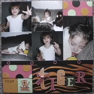
 Done with Imagine. I love these colors together!
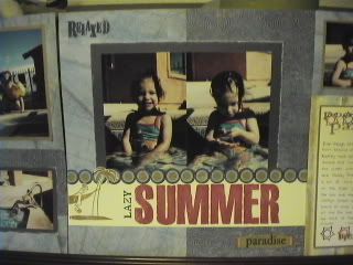
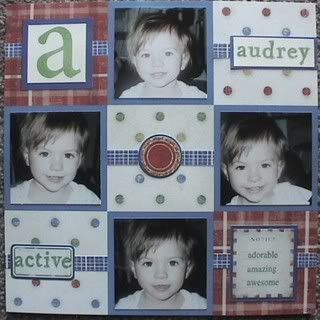
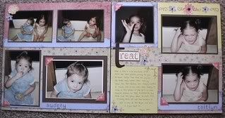
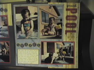 The really neat thing about these four pages is that it only took me about an hour and a half to do all four, that includes all the stamping and journalling! I've actually done a level one kit (four pages) in about a half an hour before with no stamping, just using the stickease. And yes, it says 'sharks' above the journalling on this page. Caitlyn absolutely refused to get all the way into the water because of 'sharks'. Even after trying to tell her that there are no sharks in the swimming pool she wasn't convinced and told us 'sharks are in water'. At least she's not taken that so far as to be afraid of getting in the tub!!
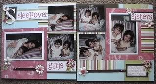
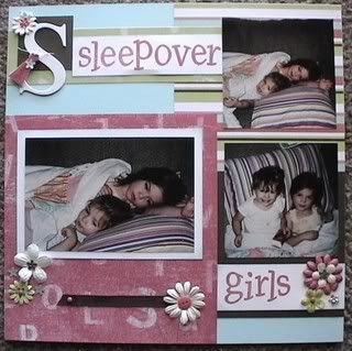
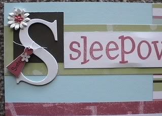 A close up of the title. I just love the chipboard S and the tag. In fact doing this page made me think about doing an alphabet album using the lowercase chipboard letters. It would be so cute!!